Flexential
_
Client Category
Technology, Cloud Storage
Project Type
Brand Development

How do you support a Merging two IT companies under one bold, human-centered brand.
Flexential was formed when Peak 10 and Via West, two legacy companies in IT infrastructure, joined forces. The organization offers colocation, connectivity, cloud, managed solutions and professional services to 4,200+ customers across the U.S. and Canada.


Brand Strategy
In-depth research was performed to determine shared attributes between the organizations. Outside of delivering superior products and services, it was the quality of their people and customer service that made the difference for current and potential customers. These findings informed the development of the brand platform and positioning.
Brand Positioning:
The power of people in a technical world.
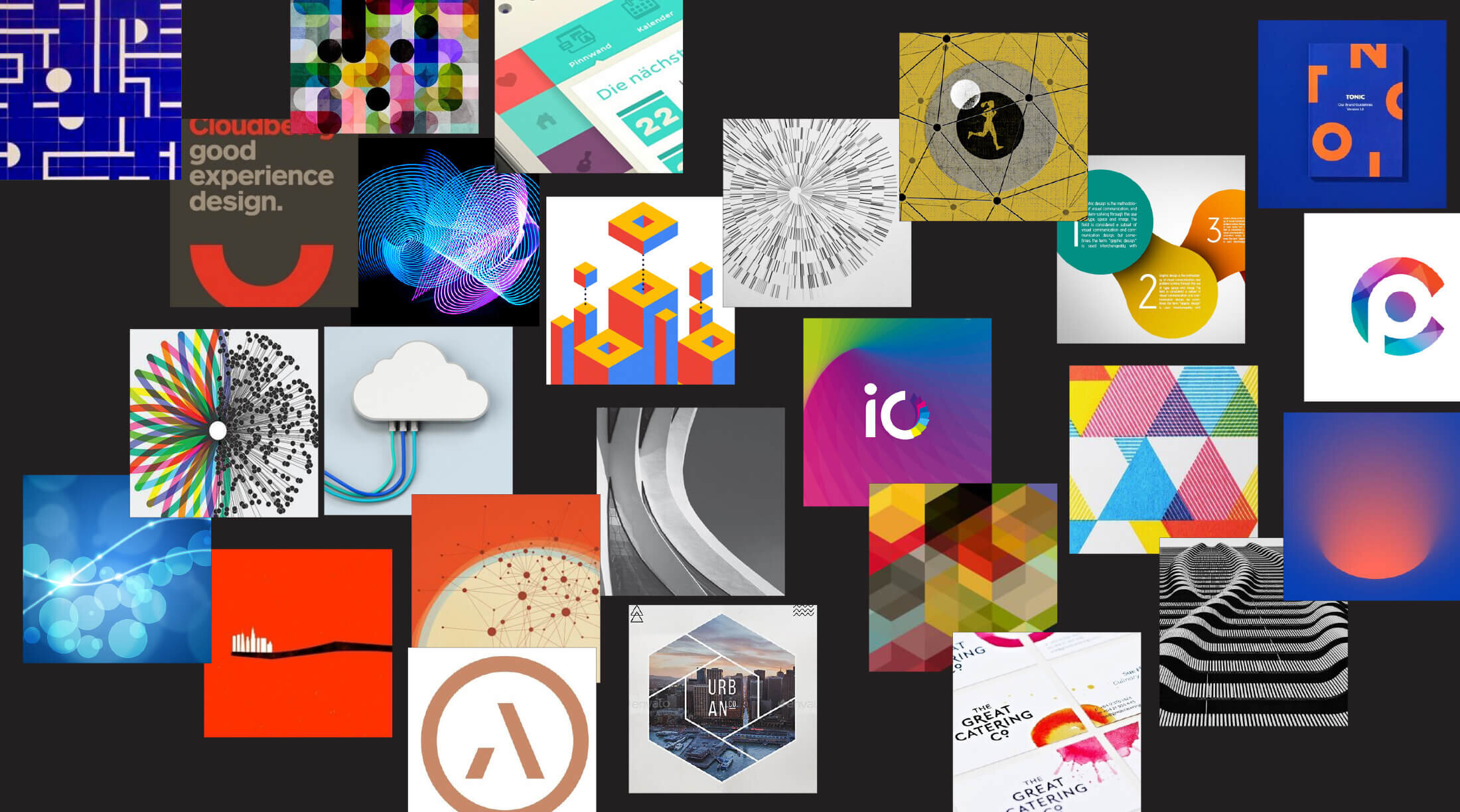

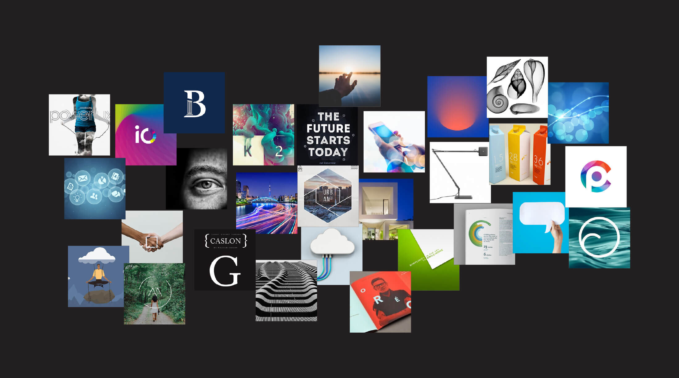
Collaboration
Collaborative workshops with a variety of key stakeholders were held to gather input about possible directions for the new brand identity. (I’m a big believer in collaboration that invites different perspectives to influence creative direction.) Participants built multiple collages that expressed their ideas about what the visual system should contain. Consistent themes emerged to guide our thinking and exploratory design work.
Visual Language
Exploration
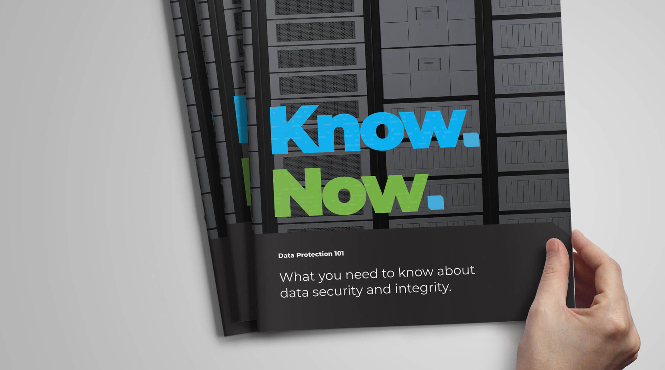
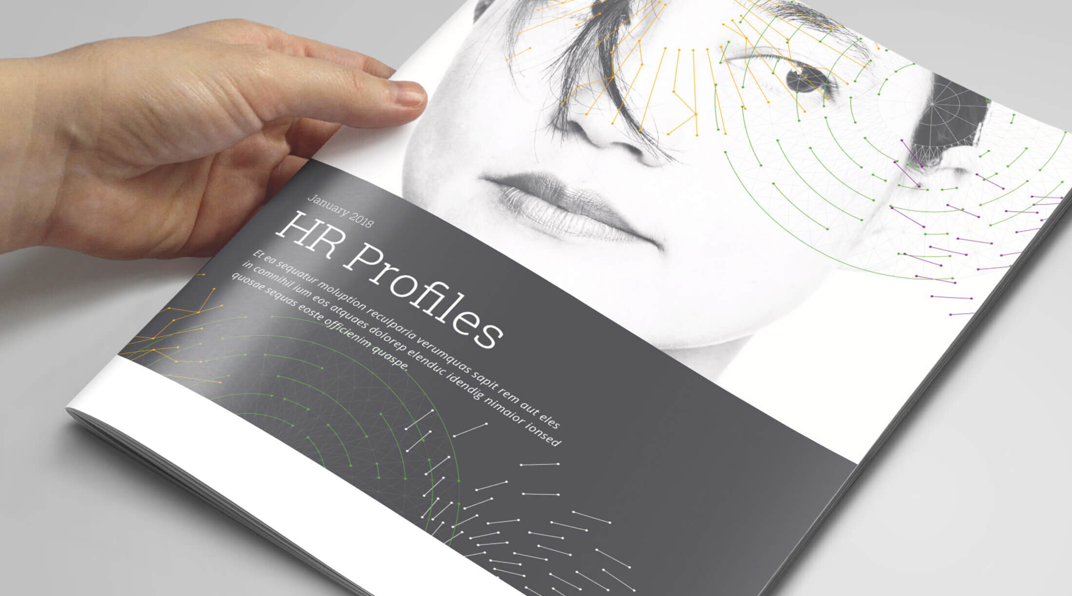
Visual directions for the brand was based on the themes of connectivity, simplicity and transformation, which came up over and over during the collaborative workshop sessions. During this time a thorough audit of existing competitors, like Amazon AWS, was conducted to make sure my work was distinctive and ownable. This research drove decisions related to brand color palate, logo design and components of the visual language.



Logo Development
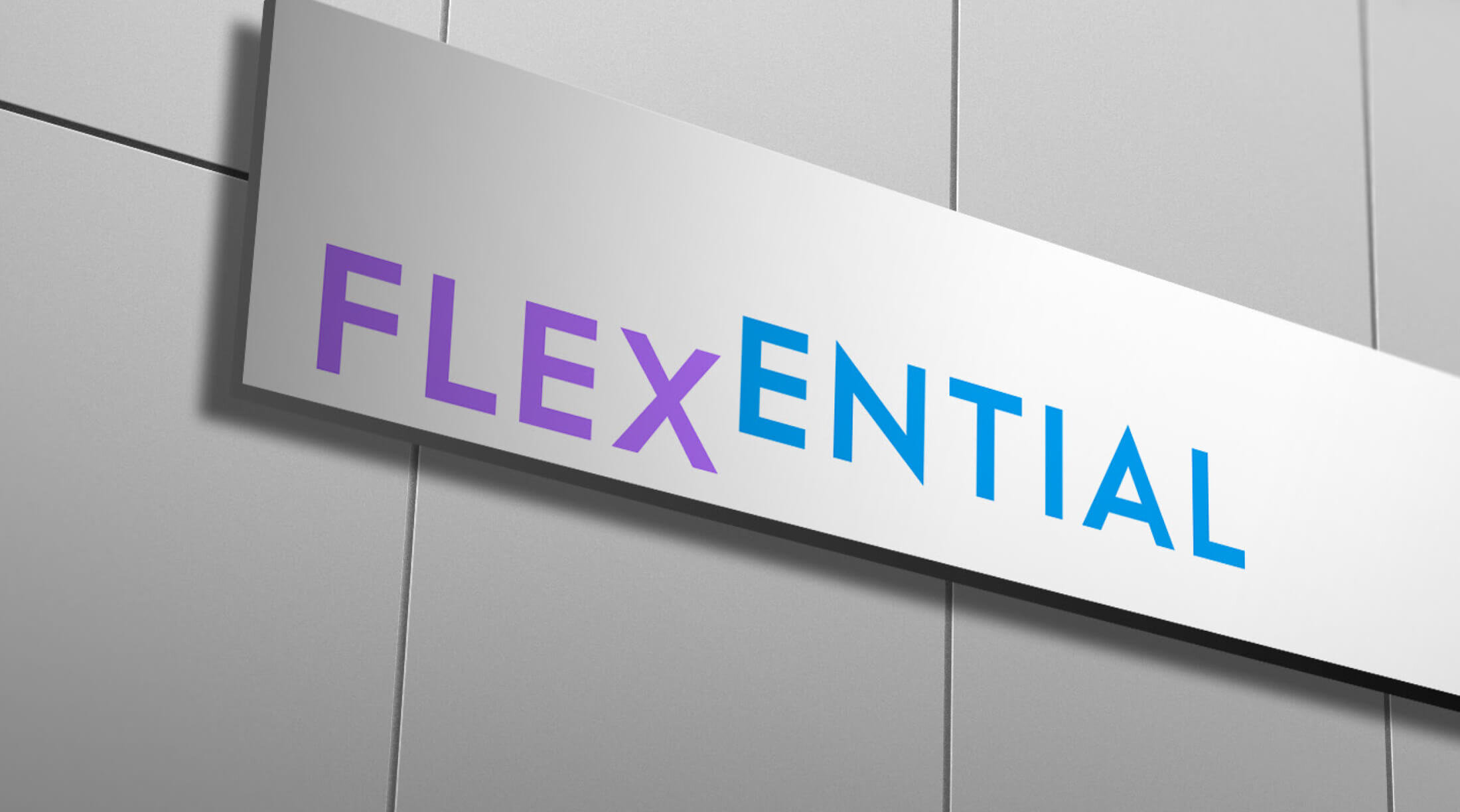
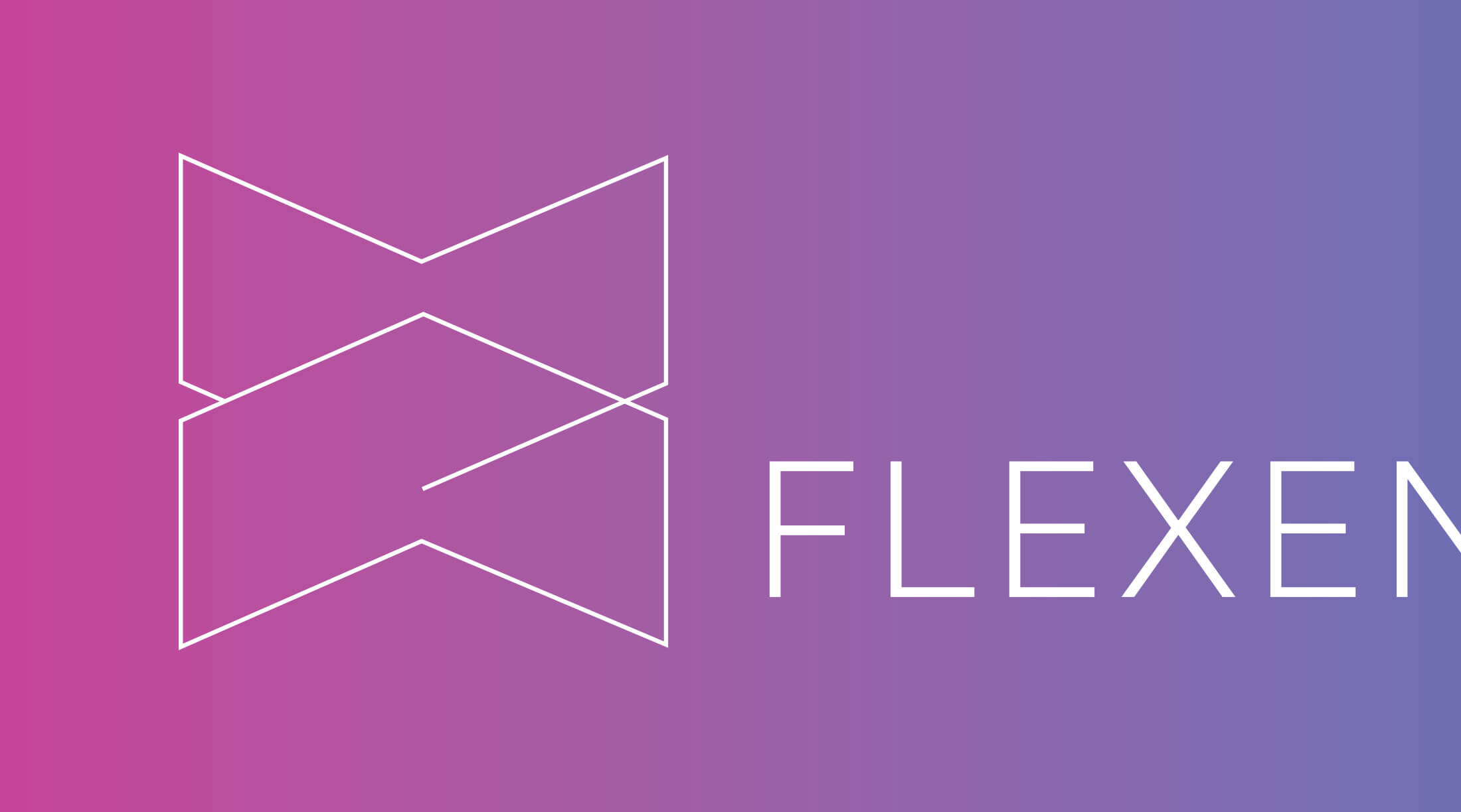
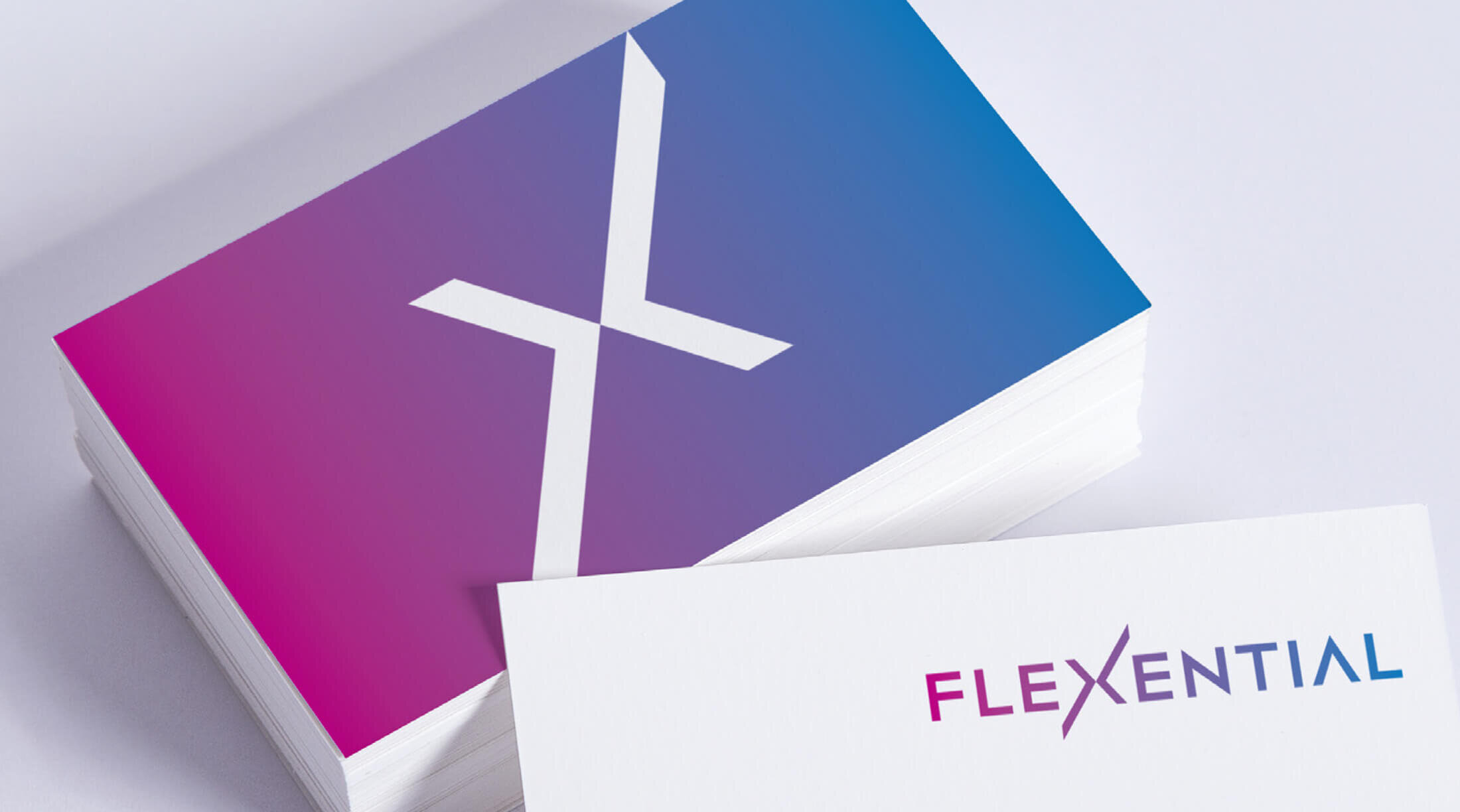
A collection of names was created and tested before settling on Flexential, a combination of “flexibility” and “essentials.” I explored a variety of icons, type treatments and color palettes and looked at different ways to use visual emphasis to create something differentiating, from focusing on the letter X to breaking up the name in different ways.
Brand Identity
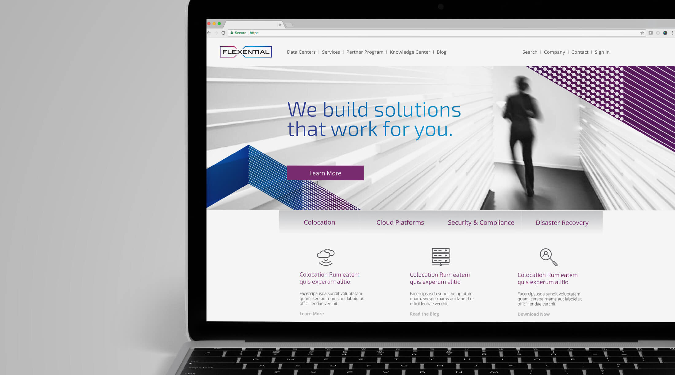
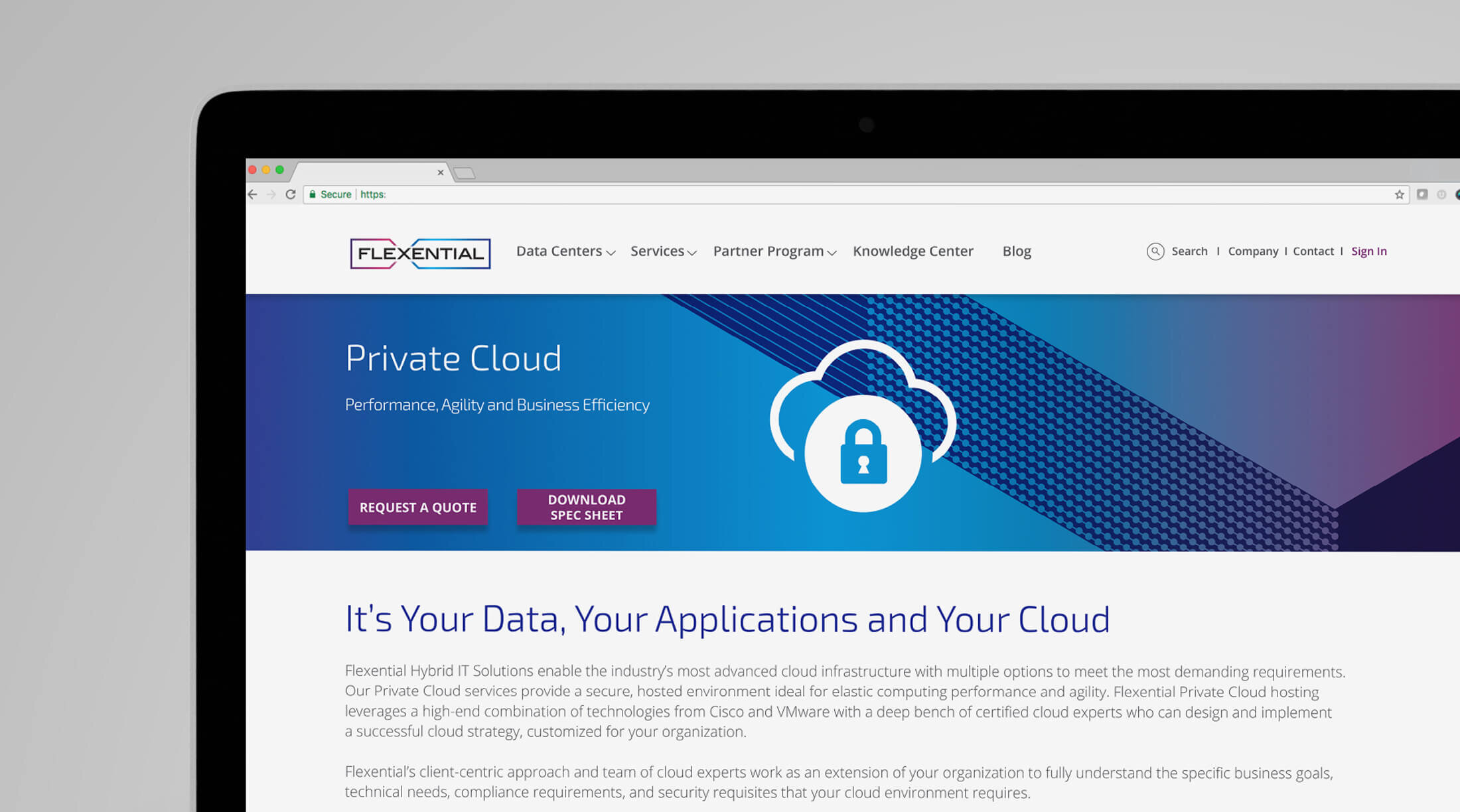
The final logo encloses the logotype in a distinctive and ownable shape that puts the focus on the letter X—the convergence point where people and technology come together.

Visual Expression
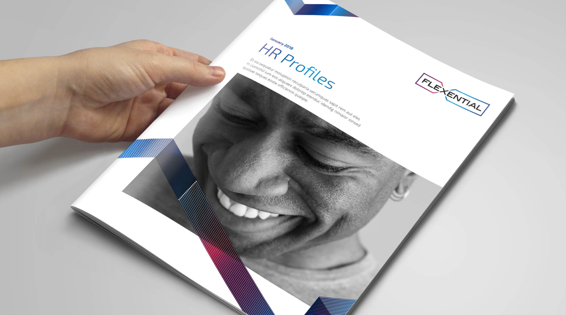
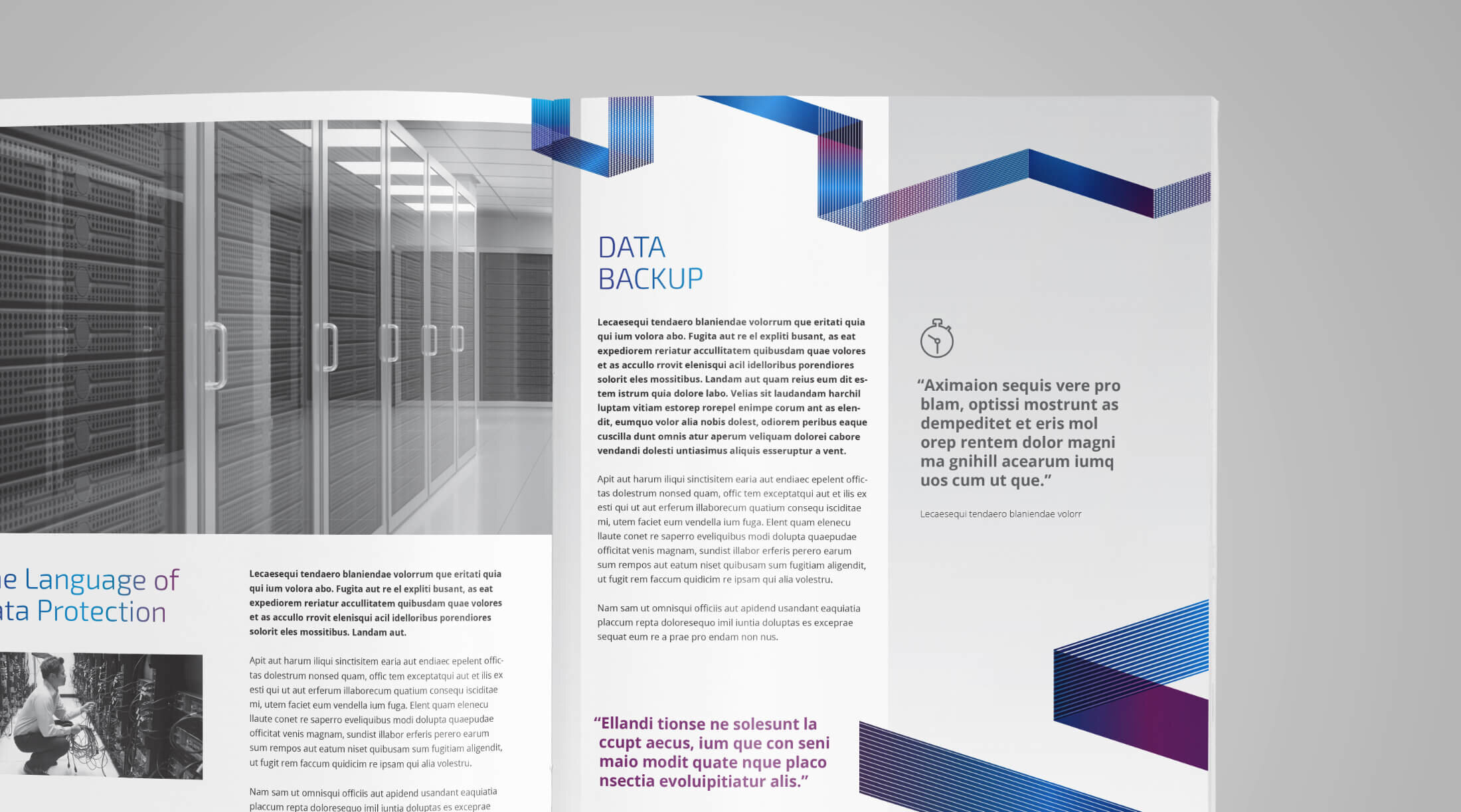
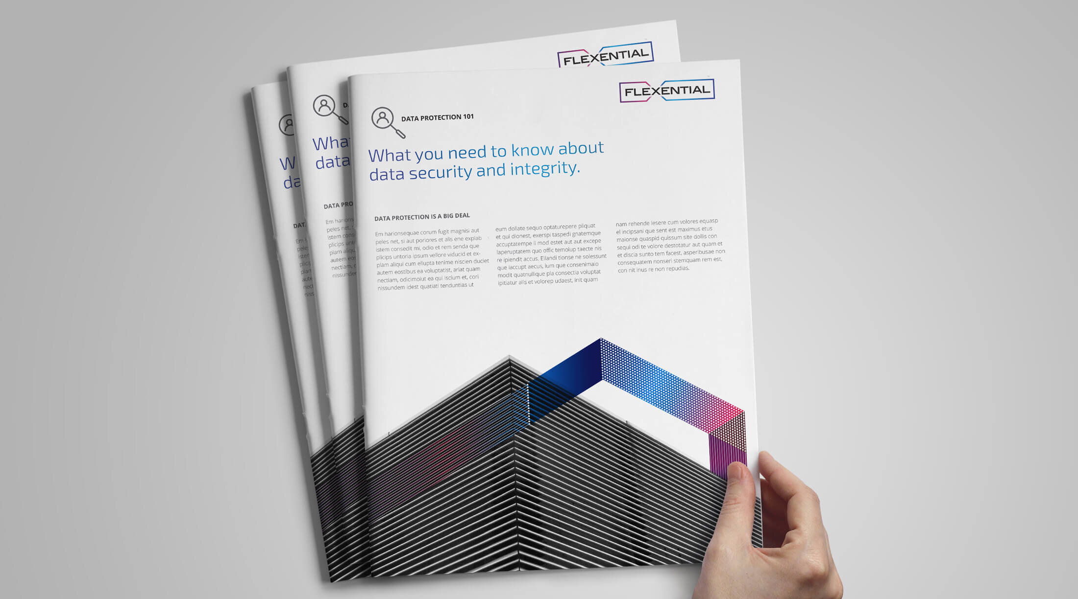
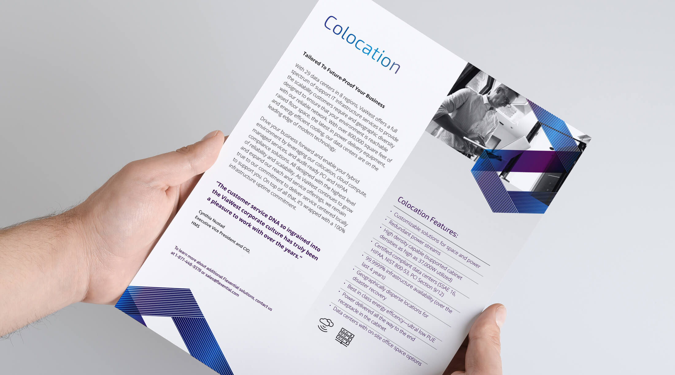
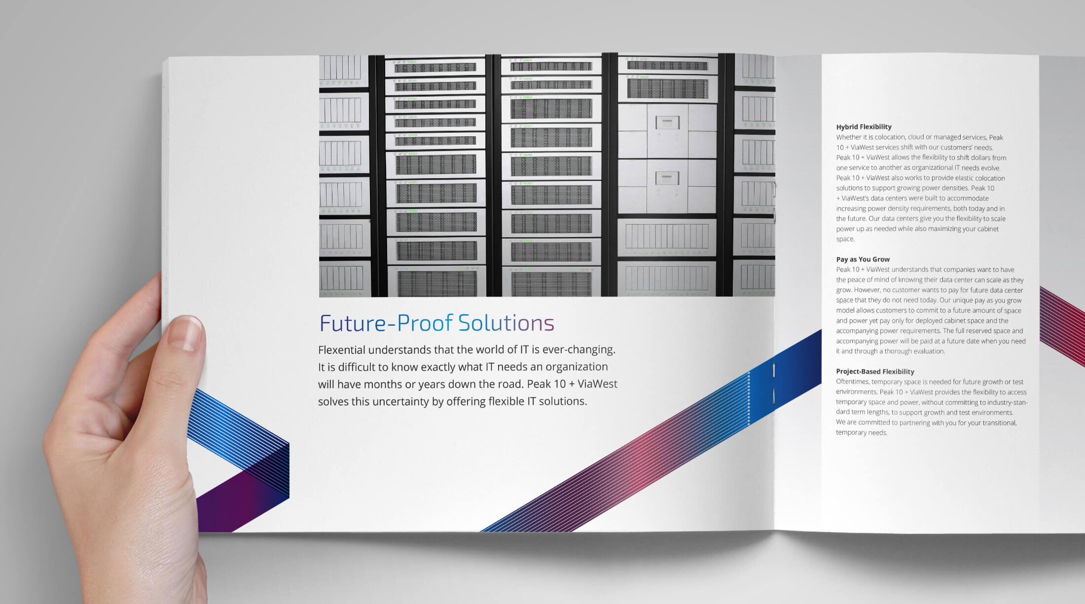
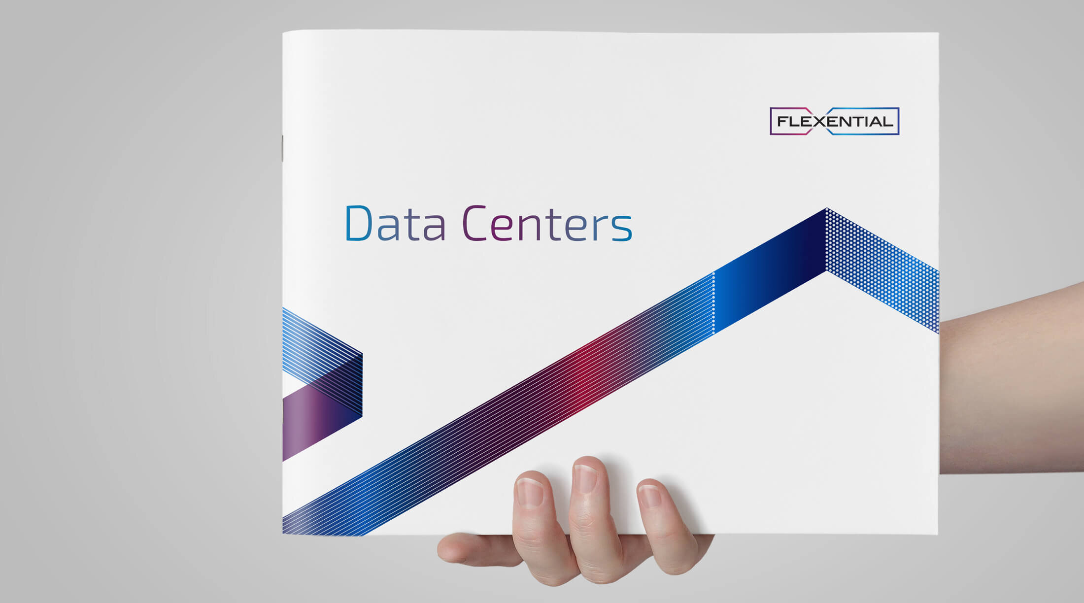
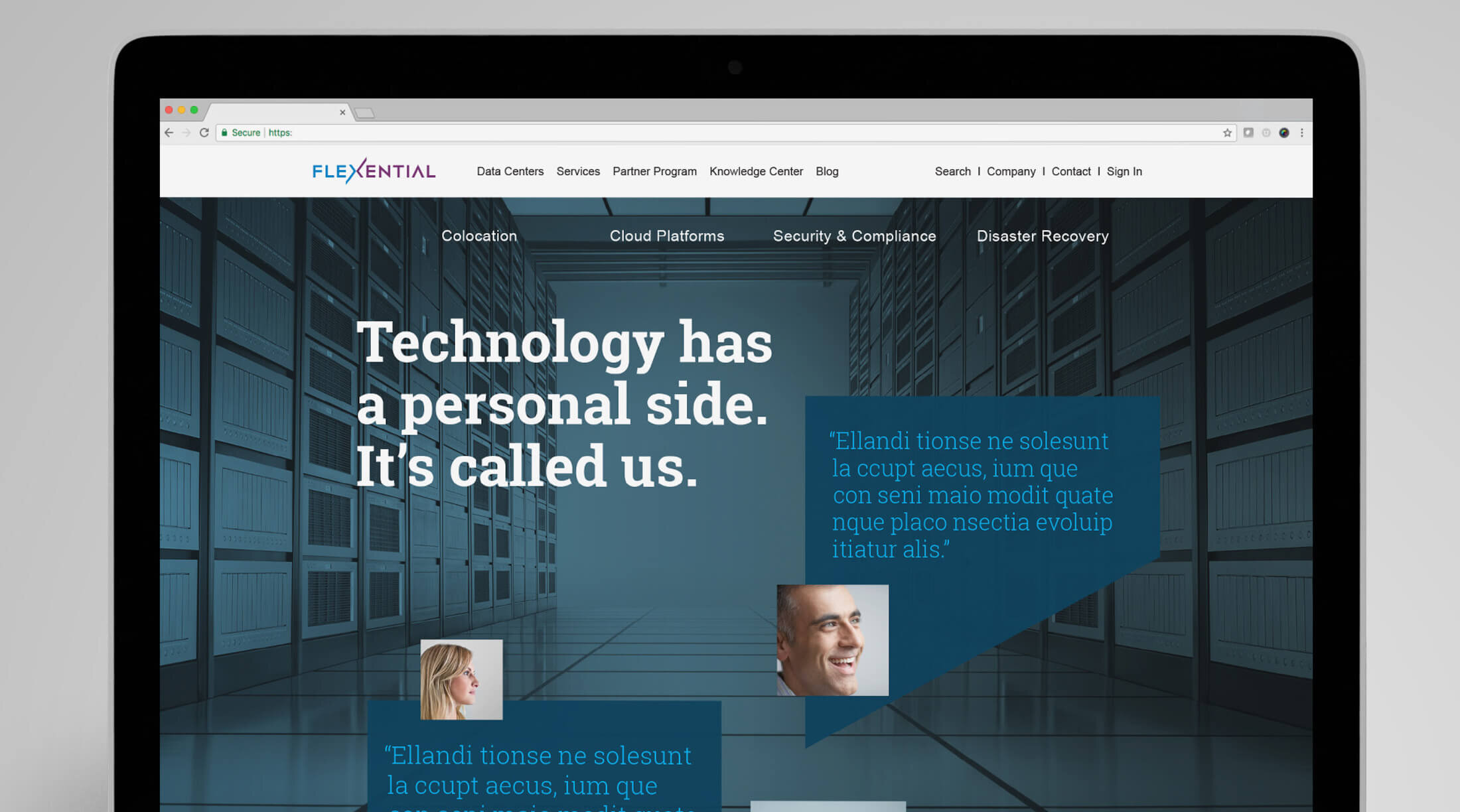
The final visual expression was inspired by the logo design and the use of a ribbon that represents connectivity and transformation. The ribbon integrates with bold black and white imagery of people and technology environments. It’s this combination that gives Flexential a distinctive look while aligning with the brand strategy established early in the process. The system is flexible, using modular parts so the graphic combinations are endless and can evolve as the company grows.

