Fig & Olive
_
Client Category
Hospitality
Project Type
Brand Development

Refining a luxury restaurant brand with visual clarity and charm.
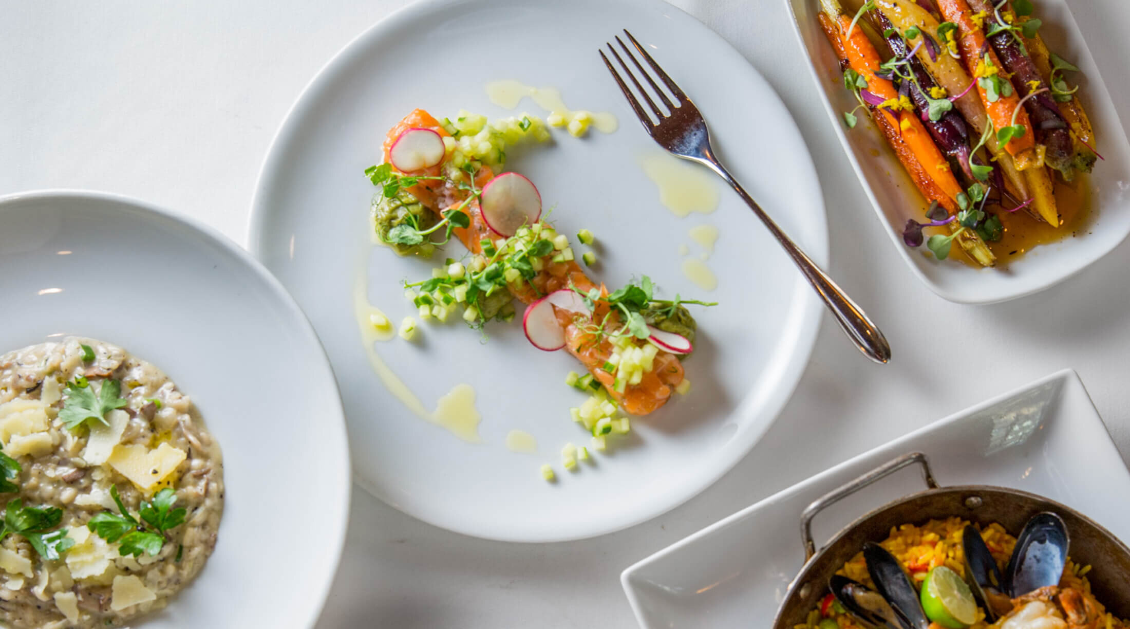
Fig & Olive showcases the refined flavors of the Mediterranean across nine locations in New York, Los Angeles, Newport Beach, Chicago, D.C. and Houston.

Brand Strategy
Fig & Olive is known for its passion for food and high standards, but it needed help recalibrating its brand strategy, message and visuals to align with its business strategy. The company was expanding and needed a roadmap to help lead the way. Rigorous research with current and potential customers that dug deep into the competitive set and trends within the fine dinning space were conducted. What was found was a lot of passion and some really good food.
Brand Positioning:
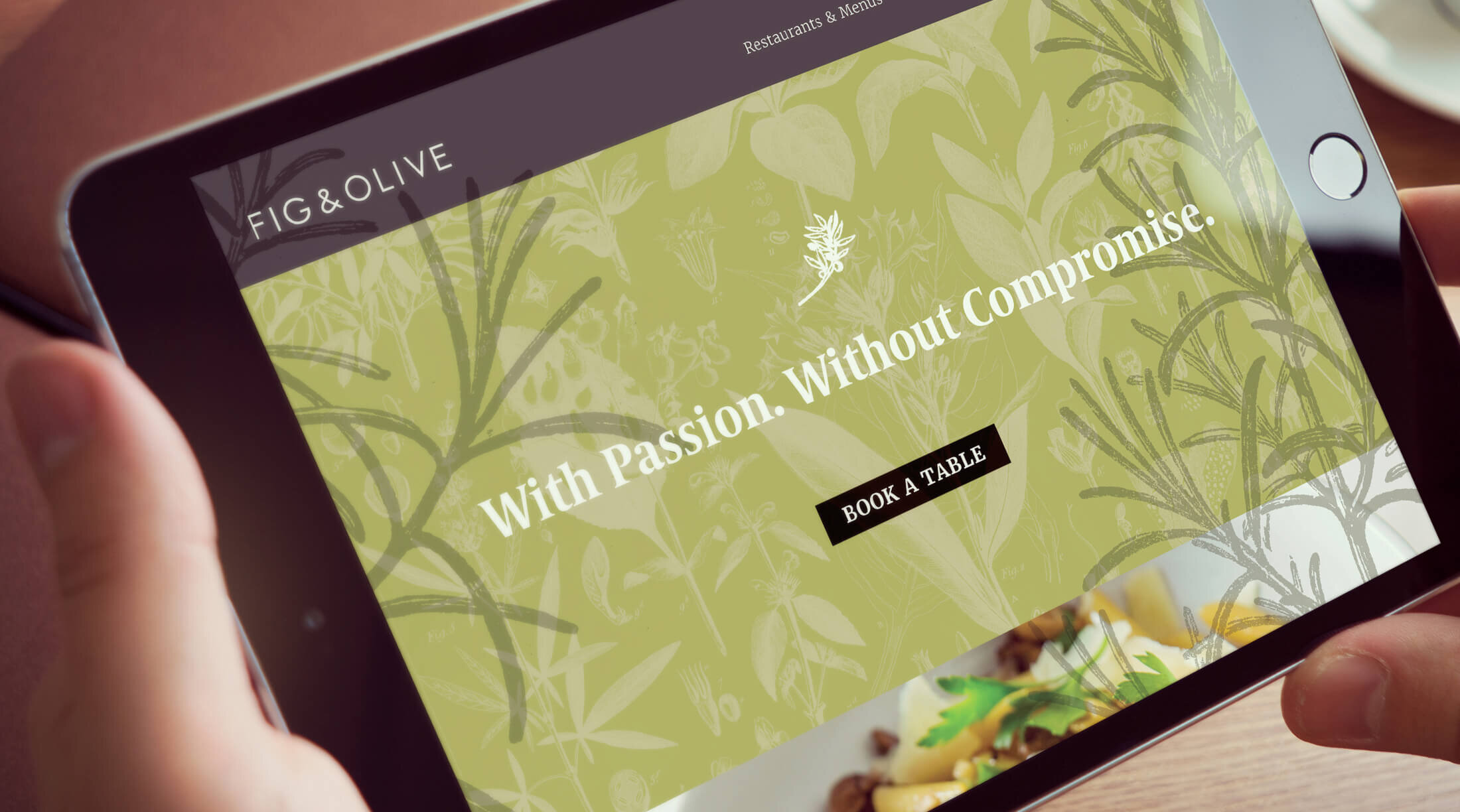
With passion. Without compromise.
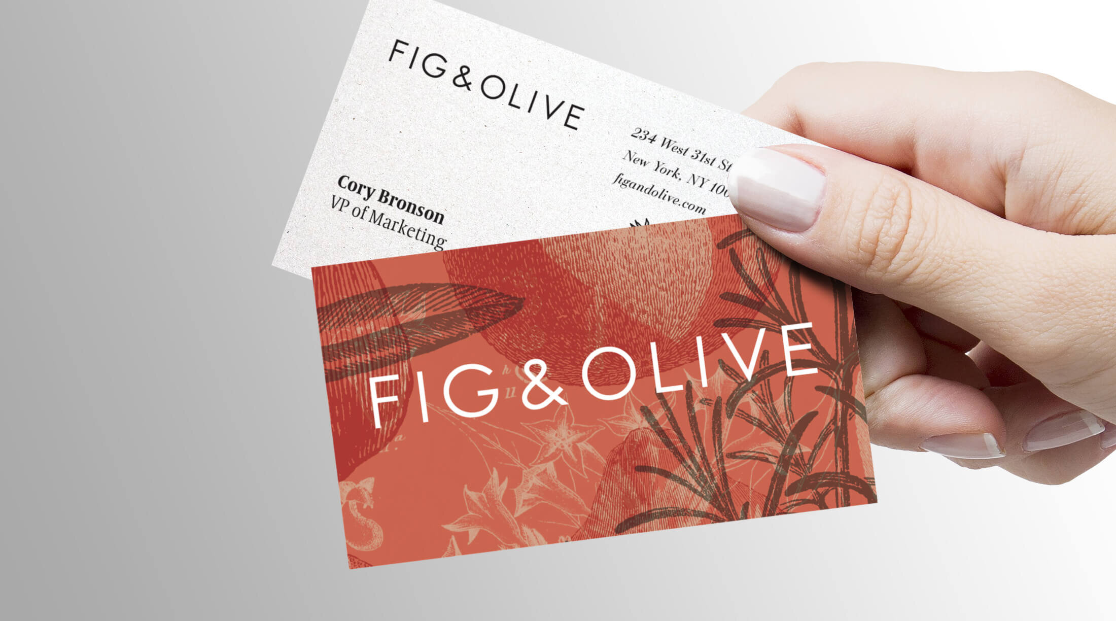
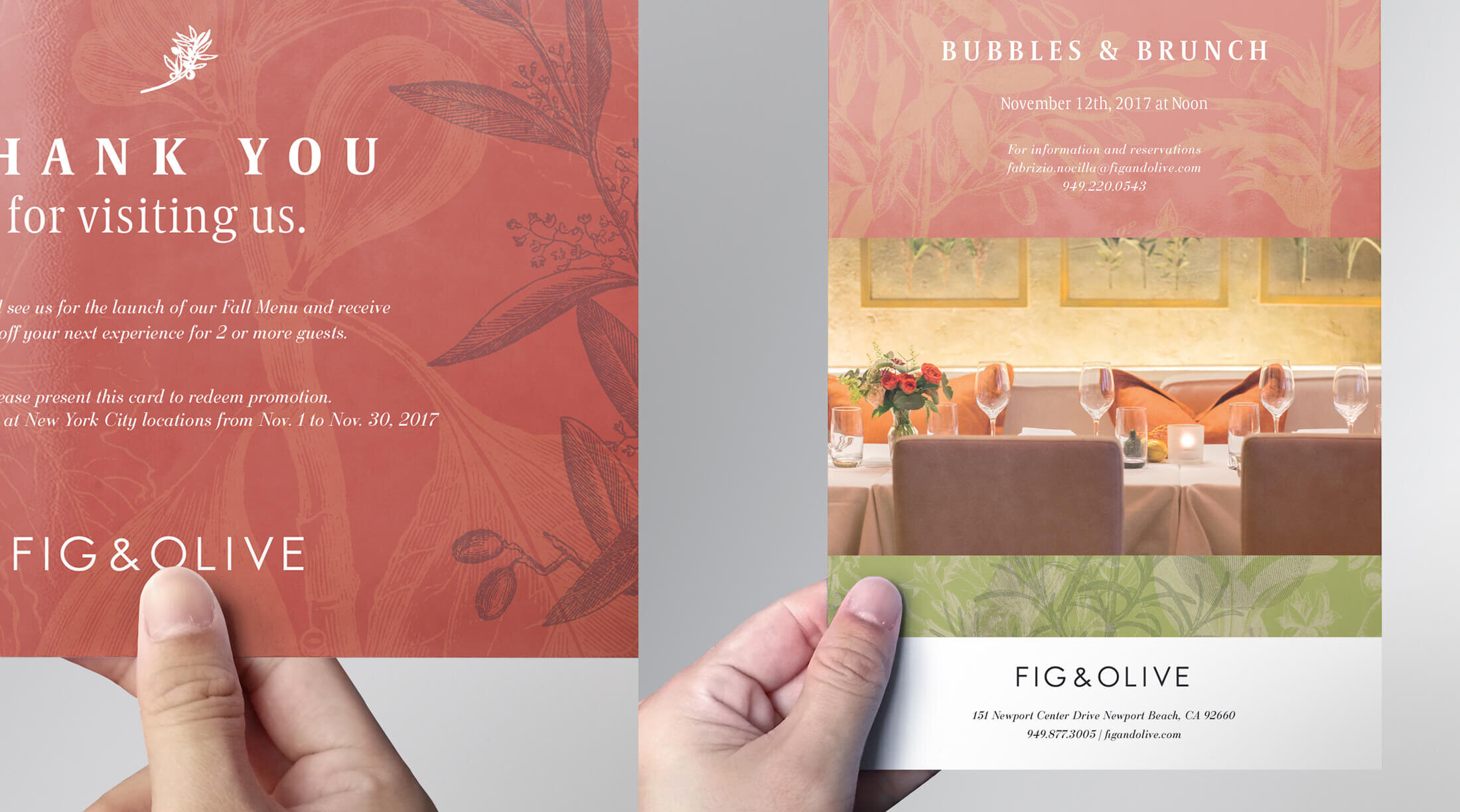
Logo Development
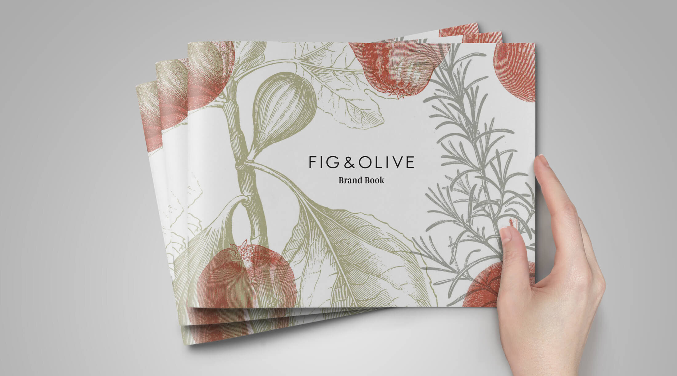
Initially a logo redesign was explored, but then reality set in with the cost of updating signage… in New York City. A pivot to preserve the budget meant cleaning up the logo to make it more balanced. The change was subtle enough so signage could be replaced over time when budget was available. In addition, secondary elements, a monogram design and refined usage guidelines for existing components, like their olive branch icon, provided a refresh.
Visual Language
Exploration
After the brand strategy and logo were determined, collaborative workshops with a group of stakeholders were held to gather input about possible directions for the new brand identity. (I’m a big believer in collaboration at this level that invites different perspectives to influence creative direction.) The participants built multiple collages that expressed their ideas about what the visual system should contain. Two themes emerged from our exploration: showcase the mediterranean cuisine and the fresh ingredients they use in each dish.

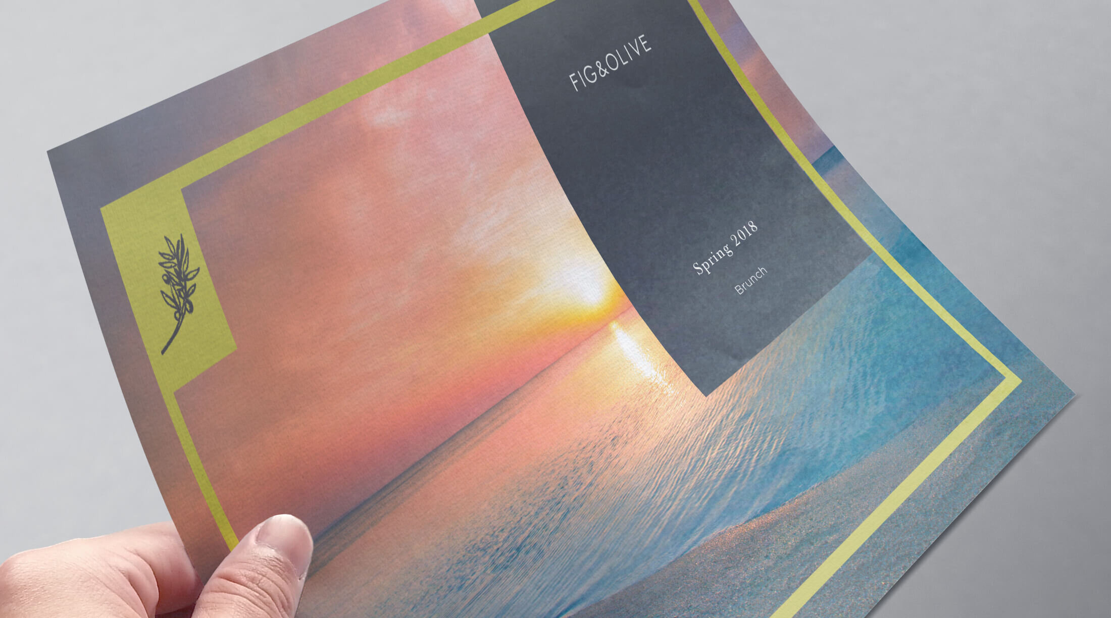

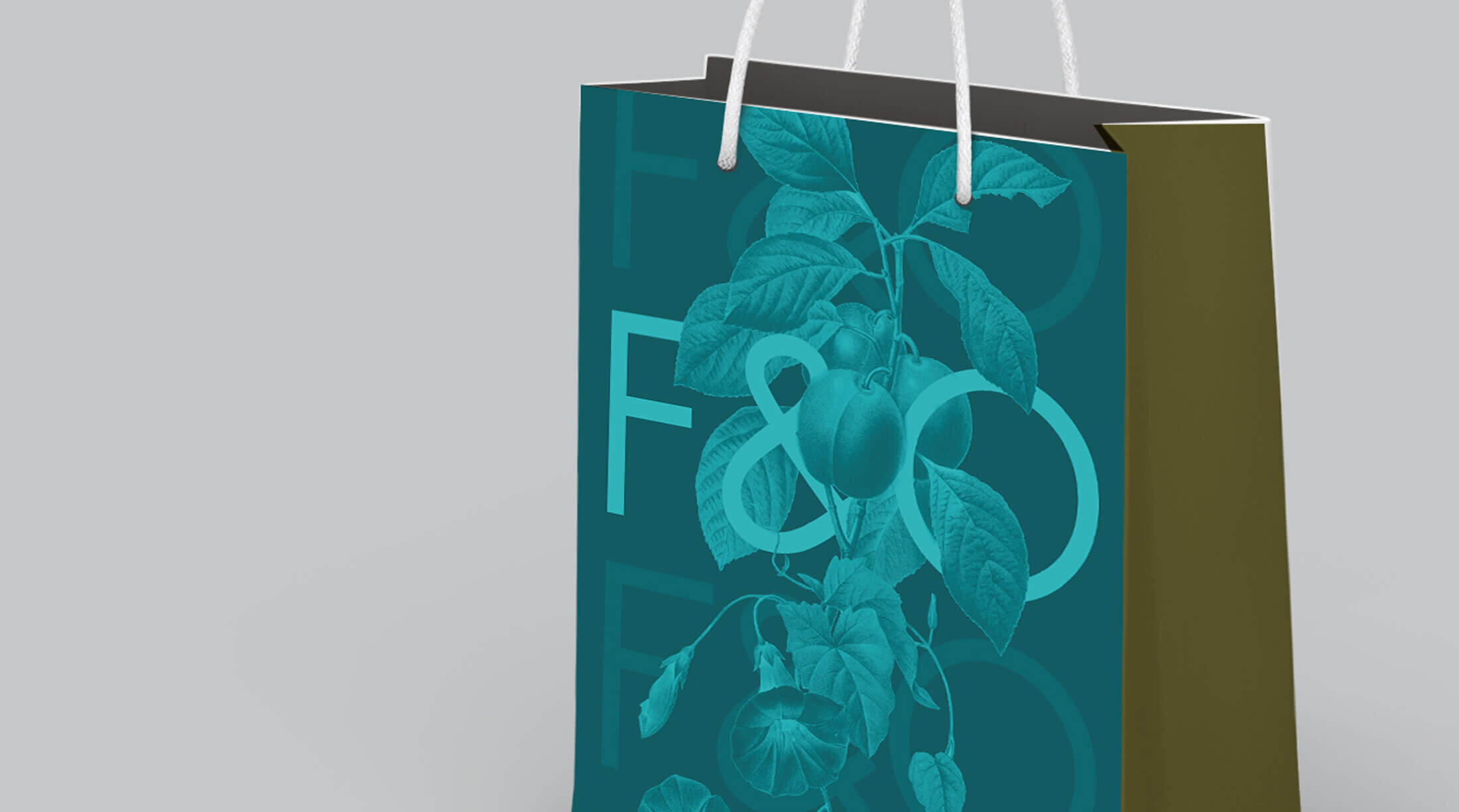


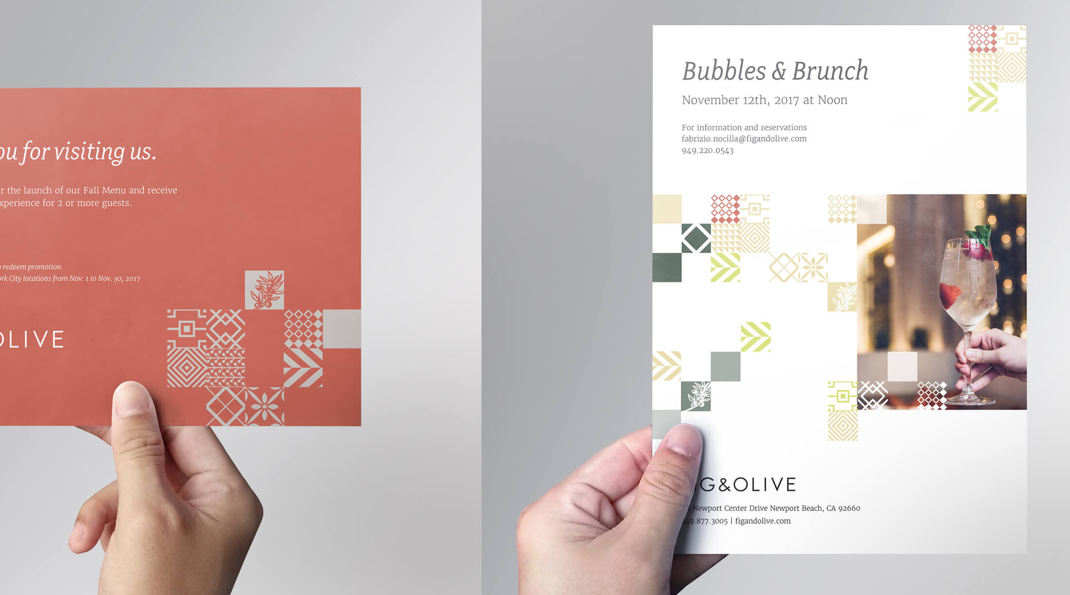
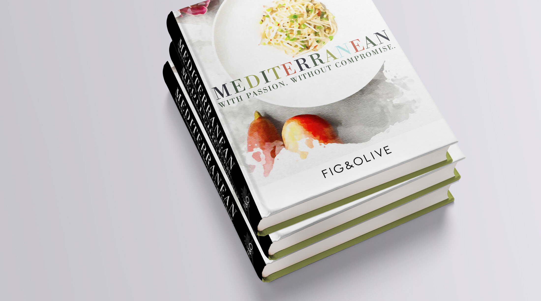


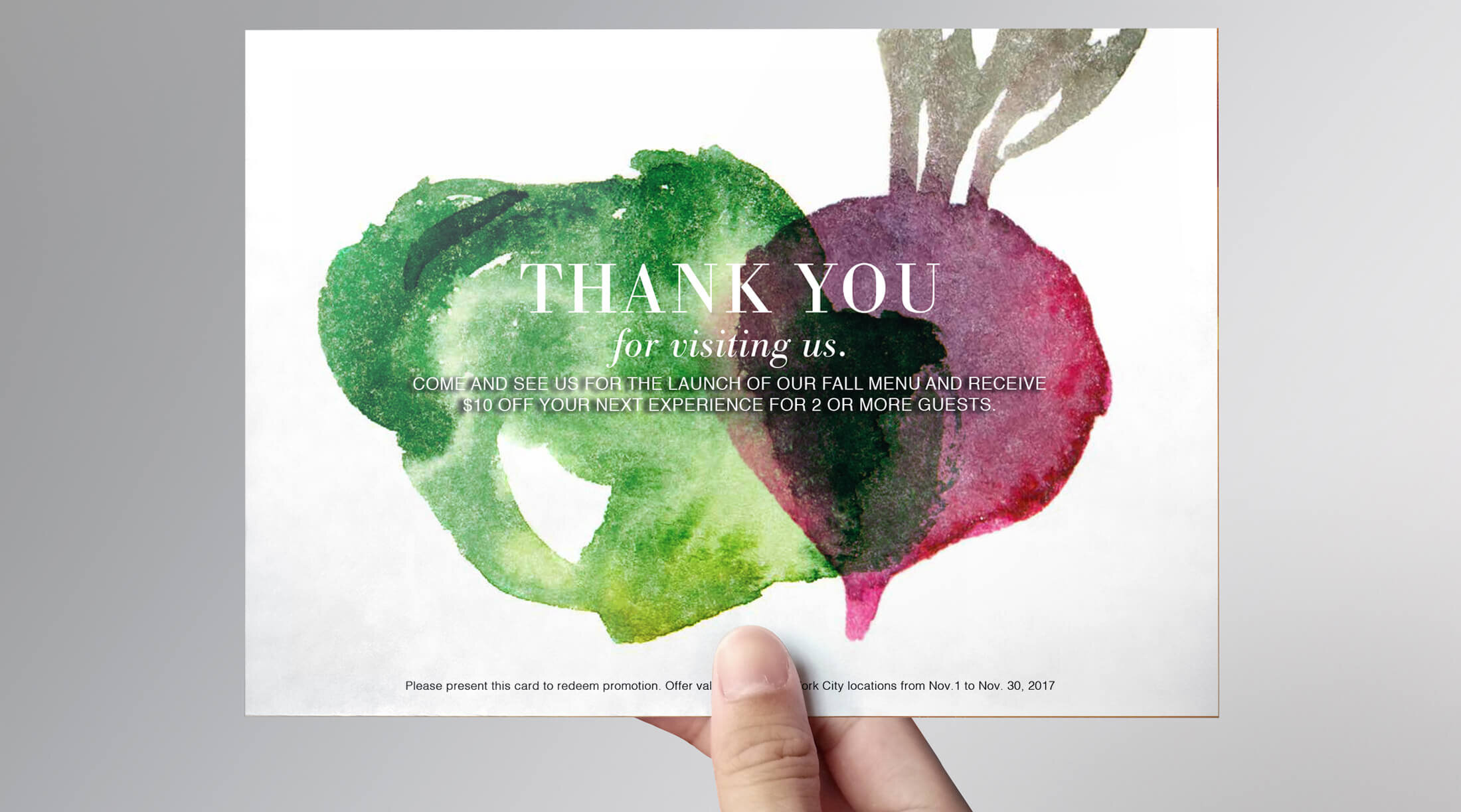


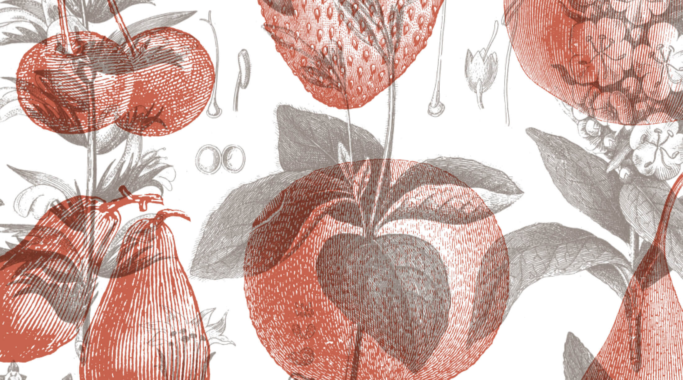

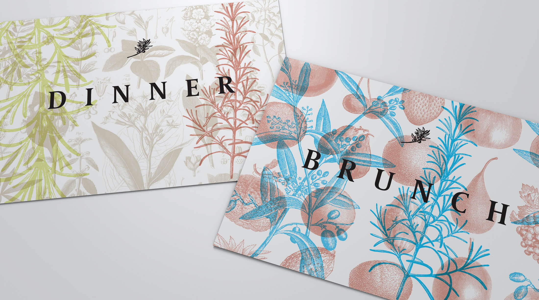
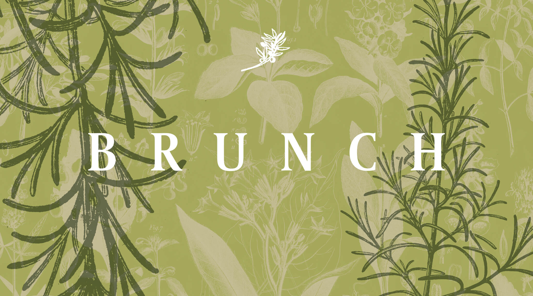
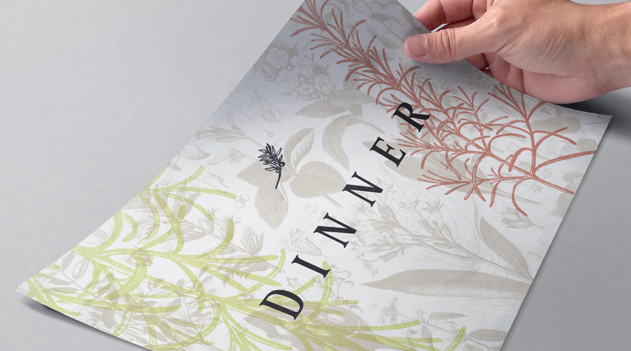
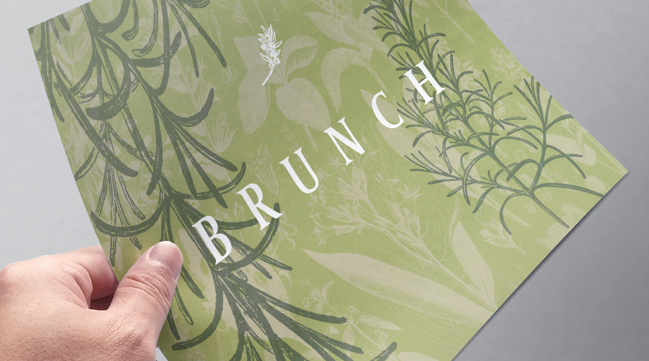
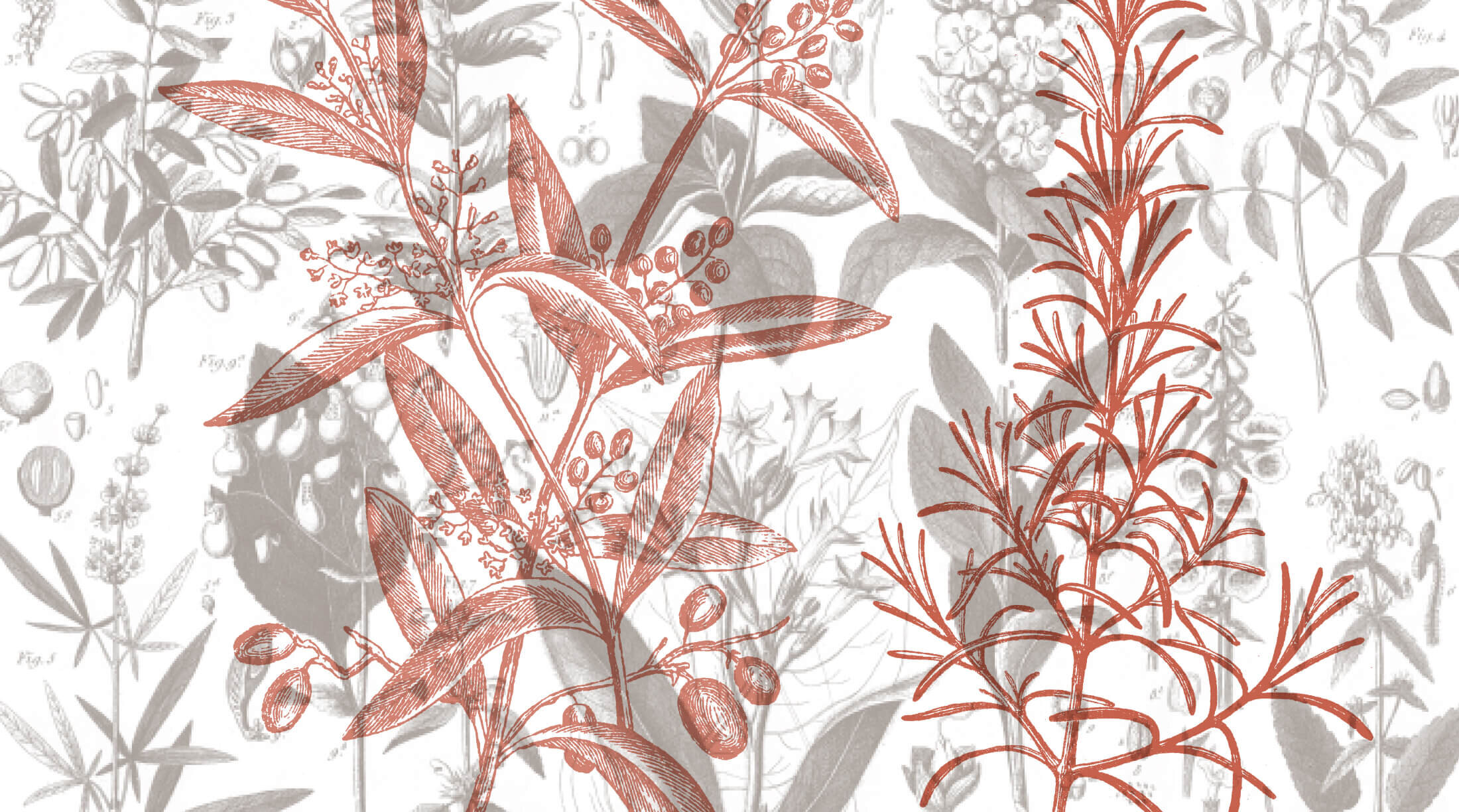
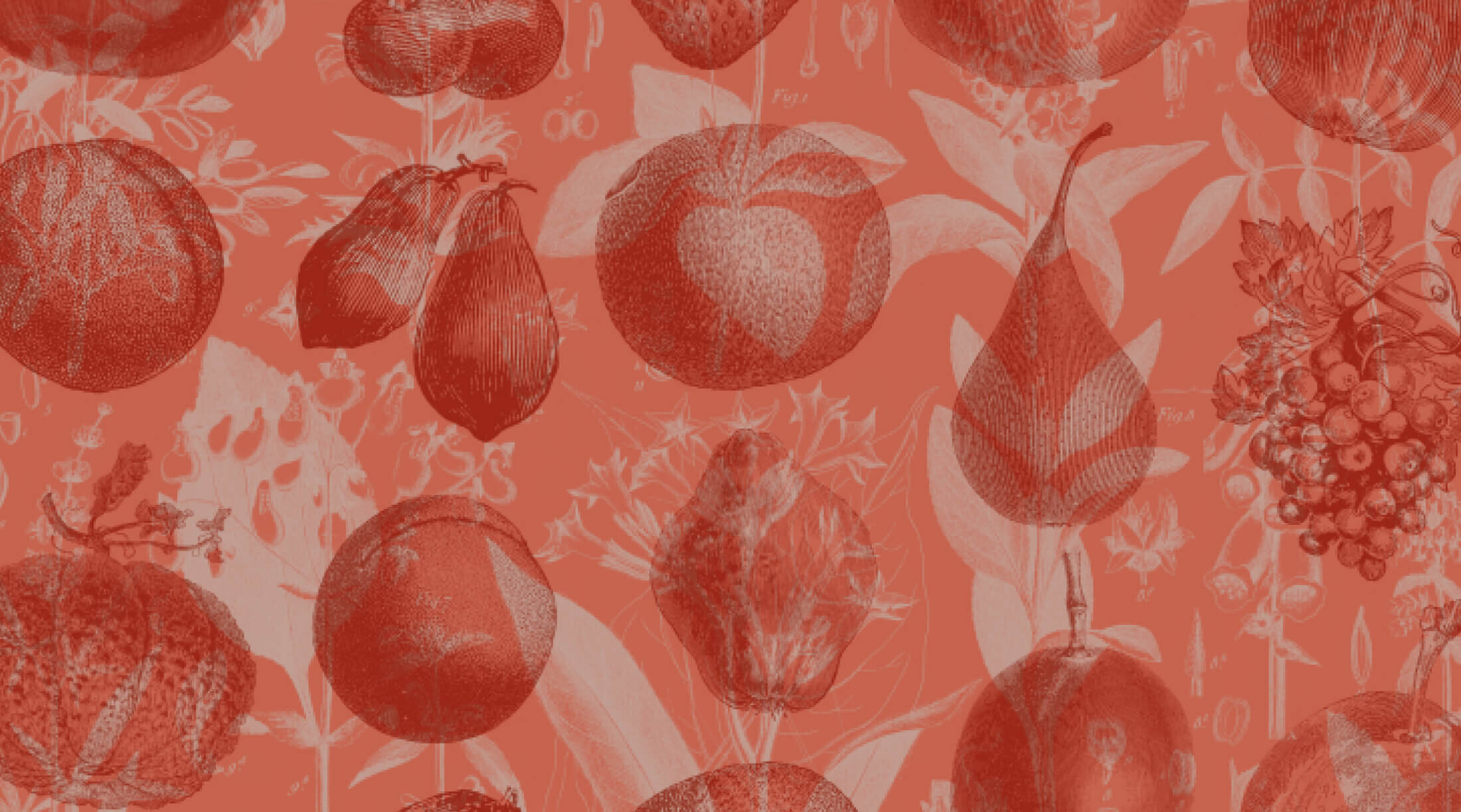
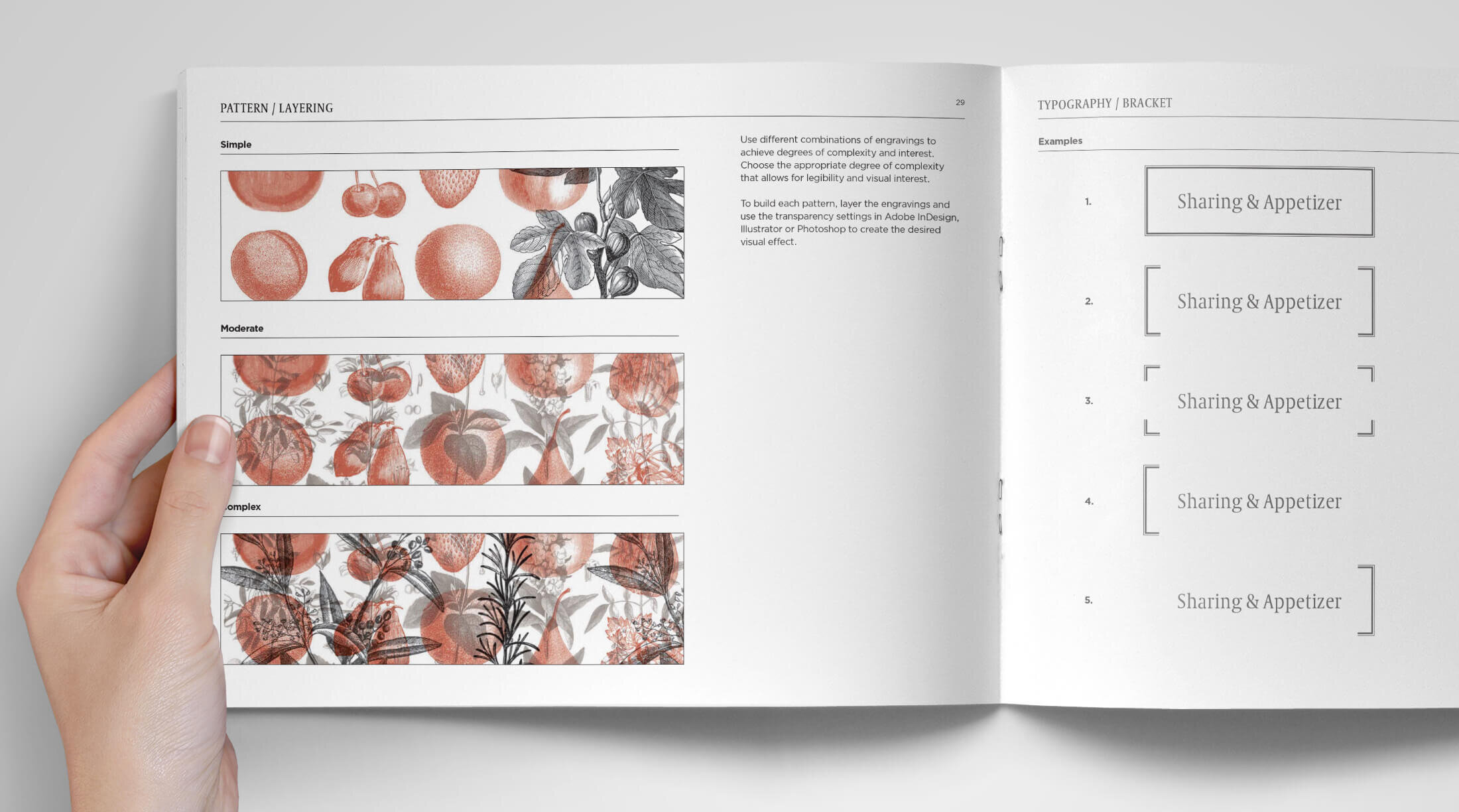
Fresh Take
The final visual system focused on the fresh ingredients, and used vintage engravings in different ways, literally using something old to create something new. This idea perfectly reflects how ingredients are used in their signature dishes. The engravings are overlaid to create unique patterns. The color palette says Mediterranean in a subtle and sophisticated way. It adds up to a distinctive system that is flexible and can expand as the brand grows into new markets.